The three catechist’s illustrations that follow are not meant to confuse our children. They represent three stages of catechist’s drawings, where each increasingly distort that which grew out of the previous stage. These are but examples of modern twentieth century art and graphically shows what influences art throughout history. The sentimentality of the opera era profoundly and quite drastically marked the first. The forties and fifties and their comic-book style etched their features upon the second. The third graphically portrays the degeneration of art in the last quarter of the century. Interesting as it would be to profoundly describe and analyze the connection between these three distortions, the nature of this column does not permit it. A few remarks will suffice.
Naturally, many good things have been done in the field of catechesis since 1930 when the first illustration was presented. In this article, we would simply like to alert our readers to the deformations that, from an essentially catechical standpoint, are especially dangerous.
***
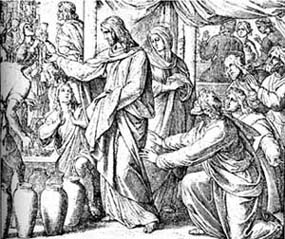
 In the first picture, taken from a Sacred History of 1930, Jesus changed water into wine at the wedding feast of Cana. Nothing of the great schools of Christian art is present in this watered down version. Mary Most Holy has just obtained an immense grace, for Jesus anticipated His miracles by performing one at Her request. In this setting, the artist portrayed the Virgin with the cold, indolent expression of a china doll. Our Lord is a languid, dreamy youth receiving the bystanders’ tokens of admiration with indifference. The theatrical emphasis of the Apostles is just as ludicrous. The ambience is impregnated with a heavy sentimentality.
The artist’s intentions may have been good, but inspiration is completely lacking. He desired to represent Our Lord and His Most Holy Mother as modest and kind in spite of the greatness of the triumph, the Apostles as enthusiastically edified, and the wedding feast as crowded and lively. His art, however, came out artificial and lifeless with an aura of romanticism. He did his best to convey a dignified, beautiful, pious idea of the Gospel scene. And, however great his failure may be, it cannot be said that the result is grotesque or caricature-like.
***
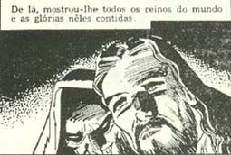
Next come scenes from a comic strip called “Sacred History” published in 1954. The seriousness and “artistic” (we put the words in quotes because artistry is absent in both cases) talent dropped in every respect, both graphically or psychologically! Here is a romantic cinema idea of the temptation of Our Lord in the desert, or better, a comic book conception – a deplorable byproduct of Hollywood.
 The position of the head; the wandering, absentminded gaze impregnated with sentimental melancholy; a romantic type of chiaroscuro; all muster in this figure the traits of a hero from a second-rate movie whose title could well be, “Beau Geste Wanders in the Desert, Longing for his Homeland.”
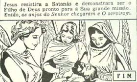
After the hero’s affliction comes the happy ending and the girls. Having overcome temptation, Jesus is served by angels. But what angels! Feminine faces and bodies; bare arms; only the wings could be termed “angelic.”
 Where these two sad examples came from is not important. What is important is the actions of the Gospel these illustrations intended to instill in children. The scene was probably stylized in comic strips to please them with the result that all that remains of the Gospel is the title. The rest is pure comics.
***
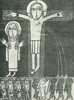
This last illustration is the tip of the upside down iceberg. It comes from the Offertory of the Missel de Frère Yves (Missal of Brother Ives’), intended for children from 7 to 12 years old.
The face is astutely asymmetrical. Only the left eye was given an eyebrow; only the left side of the nose has a nostril; the straggly beard grows only on the left side of the face, forming extravagant and ridiculous rings extending up instead of down. The hair, drooping without grace or nobility, looks like strands of wire. The arms could be called cylindrical tubes. The palms of the hands are disproportionate with the long fingers. The shapeless body: the legs of unequal length; in short, everything characterizes a being which is fundamentally ill-formed.
 The presence of a method in all that deformity is worthy of note. Essentially, the deformity consists in a kind of organic disease depriving the body of the strength to grow and develop normally. It would be better called the rough sketch badly done, than one well drawn. The insertion of the hand into the arm, the latter into the body, and the lack of elbows and knees, gives the impression of a stiff being of ridiculous movements.
All this is at the service – or disservice – of a wretched mind that stares dementedly (there is no other word for it), at the world with the serenity and unconcern of one who is unable to perceive his own deformity, or the contrast between it and the composure, harmony and dignity of nature and the universe.
Matter. He merely “nailed” one foot while leaving the other dangling lazily. The wound in the side squirts out three streams of blood as from a childish masterpiece.
The artist seems to be as foolish as his drawing. One feels inclined to title the picture, “Self-portrait.” This also would perfectly explain the figure to the side – a feminine version of his personality.

